Sustainability Center User Guide
Support Document
0 mins to read
The Sustainability Center is used by Fleet Administrators who have access to entire fleets or groups of fleets to review sustainability trends, and make decisions based on objective energy and fuel data, in an effort to reduce environmental impact.
User Guide
September 2024
Introduction
Sustainability Center is used by Fleet Administrators who have access to entire fleets or groups of fleets to review sustainability trends, and make decisions based on objective energy and fuel data, in an effort to reduce environmental impact.
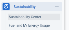
To access Sustainability Center, from the main menu, navigate to Sustainability > Sustainability Center
Key features
- Emissions Intensity Reporting
- Fuel and Energy Consumption
- Fuel and Energy Economy
- Preventable Idling Events
- Electrification
✱ NOTES:
- The Sustainability Center does not support FedRAMP devices/servers.
- Screenshots in this guide are for demonstration purposes, and contain sample data only.
Navigating the Sustainability Center
Sustainability Center is displayed in four distinct sections: metric summaries, trend graph, opportunities for reduction, and electrification.
Filter dropdown menu
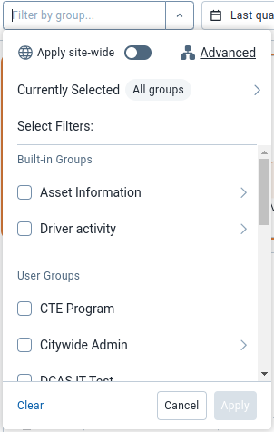
The page can be navigated by using the filter bar at the top of the screen. There are three ways to filter the data displayed: Group, Date Range and Powertrain.
Group
Filtering by Group allows you to select both built-in groups and your own user-defined groups.
Date range
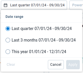
Filtering by Date range allows you to select the date range of the data displayed. The options are Last quarter, Last 3 months and This year.
Powertrain
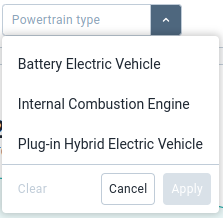
Filtering by Powertrain type allows you to select the type of vehicle data you want to display. Options are Battery Electric Vehicle, Internal Combustion Engine and Plug-in Hybrid Electric Vehicle. Having no powertrain selected will cause all vehicle data to be displayed which is considered as the All powertrain type.
Metric summary cards
The metric summary cards section of the outline a broad view of the metrics related to your selected powertrain. These cards only display data that exists within the selected date range. The available metrics are:
Selecting one of these metrics updates the trend chart, opportunities for reduction, and electrification sections accordingly.

Trend graph
The trend graph provides an overview of how your selected metric’s numbers have changed over the current of the select date range. For some metrics, multiple tabs display, allowing you to see the numbers as averages over a per-unit distance basis or as absolute values.
The number above the graph and the percentage change are based on your selected date range, even though the graph shows the entire years' worth of data. For more details on each metric's trend graph, visit the Trends section contained within each metric section in this guide.
Opportunities for reduction
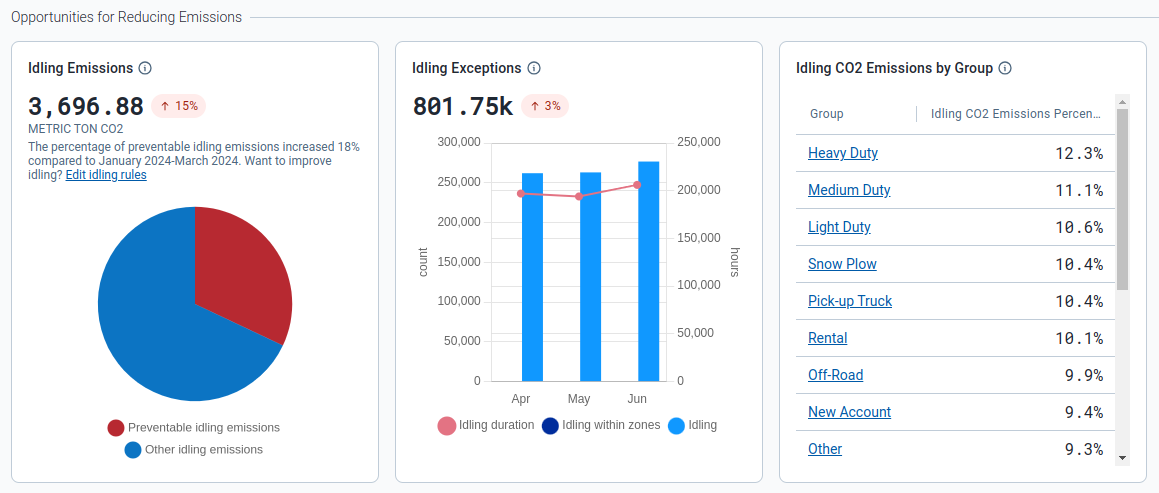
The opportunities for reduction section provides data relating to usage for the selected metric while idling, and what can be reduced.
This information displays in the form of a pie and bar chart, and data table. The pie chart informs you of how much of the selected metric is produced or used while idling, along with the portion you can reduce within your fleet. The bar chart displays the total idling exceptions and their total duration in hours, along with the amount of idling that is done within your user defined zones. The data table tells you the top 20 groups that have the largest percentage of the selected metric while idling.
For more detail on either of these charts, visit the Opportunities for Reduction section contained within each metric section within this guide.
Electrification Section
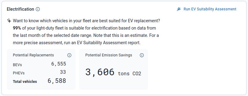
The Electrification section outlines how much of your light-duty fleet can be replaced by electric vehicles, either Plug-in Hybrid or Battery Electric Vehicles. It also shows the amount of emissions your fleet could potentially prevent by switching over to an electric vehicle. Visit the Electrification section for more detail. Or for a more in-depth assessment of your fleet’s electrification potential, download and install the EV Suitability Assessment Marketplace plug-in to your Fleet Management Application and run the report.
Understanding metric types
Emissions intensity
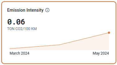
The Emissions Intensity metric, available under the All, Internal Combustion Engine and Plug-in Hybrid Electric Vehicle powertrains, displays the average amount of CO2 emissions produced by your fleet per 100km for the chosen date range.
When this metric is selected, the trend graph displays two tabs: Emissions Intensity and Absolute Emissions. The page also displays a pie chart, bar chart and data table detailing opportunities to reduce your fleet’s emissions.
Trends
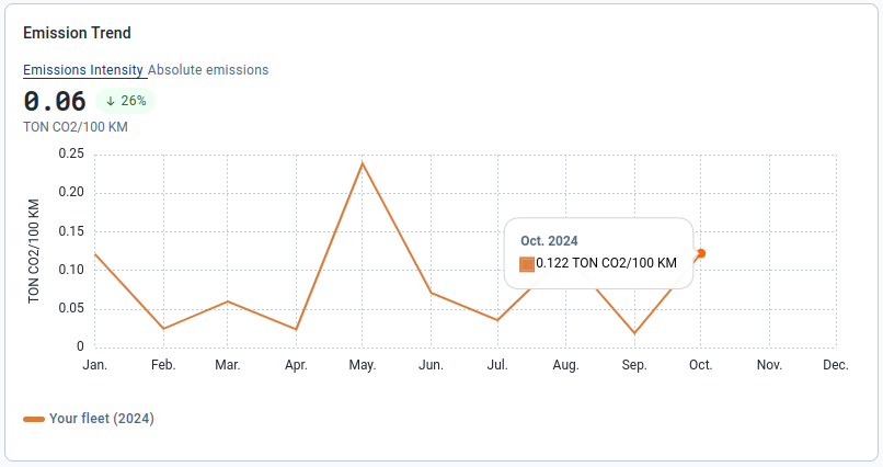
Emissions Intensity tab
The Emissions Intensity tab shows the amount of emissions produced by your fleet per 100km for the current year of the chosen date range. These emissions are measured in tons of CO₂ per 100km.
The graph displays the average emissions intensity for the selected period above the line chart, as well as the percentage change in emissions intensity compared to the previous period. Hover your mouse over the month within the line chart to view the average emissions intensity for that month.
Absolute Emissions tab
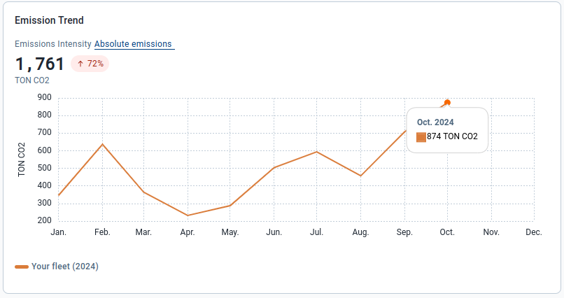
The Absolute Emissions tab shows the total amount of emissions your fleet has produced for the current year of the chosen date range. These emissions are measured in tons of CO2.
The graph displays the total emissions produced for the selected period above the line chart, along with the percentage change in total emissions compared to the previous period. Hover your mouse over the month within the line chart to view the total emissions produced for that month.
Opportunities for reduction
The Idling Emissions pie chart displays the total amount of emissions produced by your fleet when an idling restriction rule is violated within the selected date range. Additionally, it shows the percentage change in idling emissions compared to the previous period. The chart is composed of two sections:
|
|
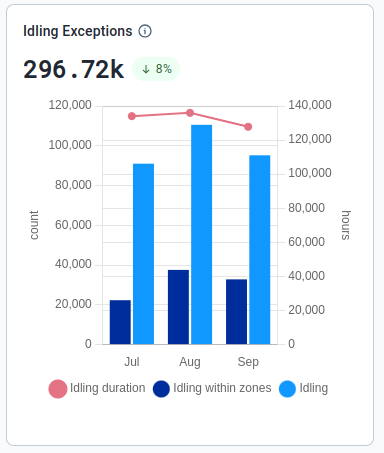
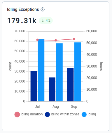
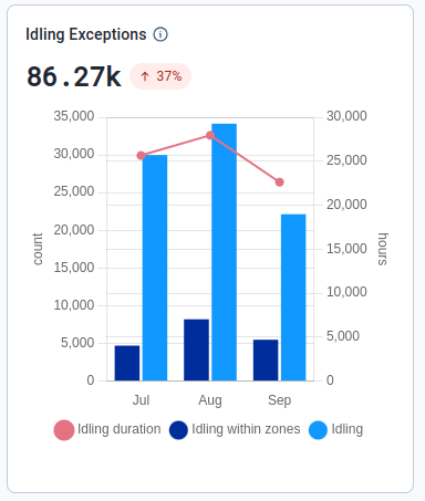
The Idling Exceptions bar chart displays the total number of times an idling restriction rule was violated within the selected date range. It also shows the percentage change in total number of idling exceptions compared to the previous period. The chart only displays exceptions for vehicles related to the selected powertrain.
The chart is composed of three sections:
- Idling duration: Displays as a line graph, this shows the amount of time, in hours, your fleet spent idling each month.
- Idling within zones: Displays as a bar chart, this shows the number of idling exceptions that have occurred within your custom-made zones each month.
- Idling: Displays as a bar chart, this shows the total number of idling exceptions that have occurred each month.
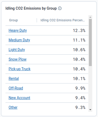
The Idling CO2 Emissions by Group table displays the top 20 groups that have the largest percentage of their CO2 emissions being produced while idling. This is relative to the total amount of CO2 emissions produced by the group, allowing you to identify which groups are the biggest offenders.
Selecting a group within the table will update the sustainability center to display data for that specific group. If you already have a group selected, the top 20 groups displayed will be subgroups within the group you have selected.
Fuel and Energy Economy
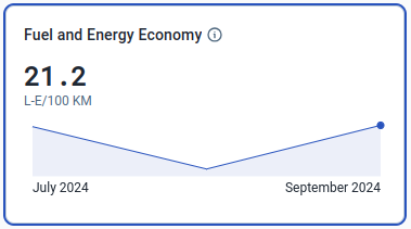
The Fuel and Energy Economy metric, available under the All and Plug-in Hybrid Electric Vehicle powertrains, displays the average combined amount of fuel and energy used by your fleet per unit of distance for the selected date range.
The measurement units displayed are dependent on your user settings found under Options > Fuel Economy Measurement. Selecting this metric causes the trend graph to display in two tabs: Fuel and Energy Economy and Fuel and Energy Used.
The page also displays a pie chart, bar chart and data table detailing ways to reduce your fleet's fuel and energy usage.
Trends
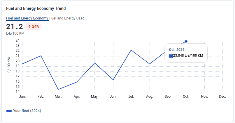
Fuel and Energy Economy tab
The Fuel and Energy Economy tab shows your fleet's fuel and energy usage per unit of distance for the current year of the selected date range. The measurement units are based on the units selected in your user settings.
The graph displays the average fuel and energy economy for the selected period above the line chart, along with the percentage change in fuel and energy economy compared to the previous period. Hover your mouse over the month within the line chart to view the average fuel and energy economy for that month.

Fuel and Energy Used tab
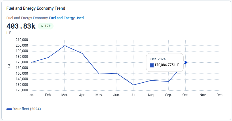
The Fuel and Energy Used tab shows your fleet’s total combined fuel and energy usage for the current year of the selected date range. The usage is measured in liters equivalent (L-E).
The graph displays the total usage for the selected period above the line chart, as well as the percentage change in usage compared to the previous period. Hover your mouse over the month within the line chart to view the total usage for that month.
Opportunities for reduction
The Idling Fuel and Energy Used pie chart displays the total combined amount of fuel and energy used by your fleet when an idling restriction rule is violated within the selected date range. Additionally, it shows the percentage change in idling fuel and energy usage compared to the previous period. The chart is composed of two sections:
|
|
The Idling Exceptions bar chart is the same as the chart displayed under Emissions Intensity; however, the chart only displays exceptions related to the selected powertrain..

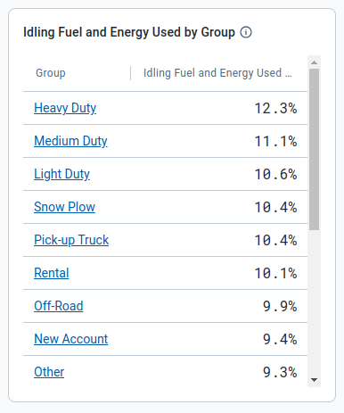
The Idling Fuel and Energy Used by Group table displays the top 20 groups that have the largest percentage of their fuel and energy being used while idling.This is relative to the total amount of fuel and energy used by the group, allowing you to identify which groups are the biggest offenders.
Selecting a group within the table will update the sustainability center to display data for that specific group. If you already have a group selected, the top 20 groups displayed will be subgroups within the group you have selected.
Fuel Economy
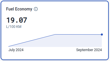
The Fuel Economy metric, available under the Internal Combustion Engine powertrain, displays the average amount of fuel consumed by your fleet per unit of distance for the selected date range. The units are dependent on your user settings under Options > Fuel Economy Measurement.
When this metric is selected, the trend graph displays two tabs: Fuel Economy and Fuel Used. The page also displays a pie chart, bar chart and data table detailing ways to reduce your fleet’s fuel consumption.
Trends
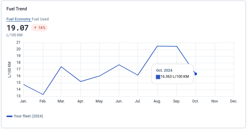
Fuel Economy Tab
The Fuel Economy tab shows your fleet’s average fuel consumption per unit of distance for the current year of the selected date range. The usage measurement is based on the units selected in your user settings.
The graph displays the average fuel consumption for the selected period above the line chart, along with the percentage change in fuel consumption compared to the previous period. Hover your mouse over the month within the line chart to view the average fuel consumption for that month.
Fuel Used Tab
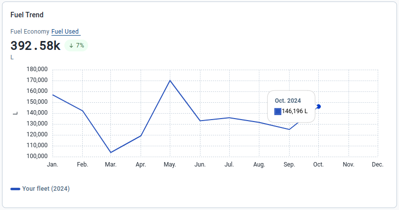
The Fuel Used tab shows your fleet’s total fuel consumption, in liters, for the current year of the selected date range.
The graph displays the total amount of fuel consumed for the selected period above the line chart, and the percentage change in total fuel consumed compared to the previous period. Hover your mouse over the month within the line chart to view the total fuel consumed for that month.
Opportunities for reduction
The Idling Fuel Used pie chart displays the total amount of fuel used by your fleet when an idling restriction rule is violated within the selected date range. Additionally, it shows the percentage change in idling fuel used compared to the previous period. The chart is composed of two sections:
|
|
The Idling Exceptions bar chart is the same as the chart displayed under Emissions Intensity; however, the chart only displays exceptions related to internal combustion engine vehicles.
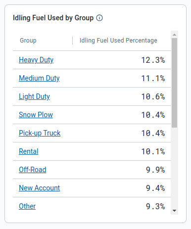
The Idling Fuel Used by Group table displays the top 20 groups that have the largest percentage of their fuel being used while idling.This is relative to the total amount of fuel used by the group, allowing you to identify which groups are the biggest offenders.
Selecting a group within the table will update the sustainability center to display data for that specific group. If you already have a group selected, the top 20 groups displayed will be subgroups within the group you have selected.
Energy Economy
The Energy Economy metric, available under the Battery Electric Vehicle powertrain, displays the average amount of energy used by your fleet per unit of distance for the selected date range. The units are dependent on your user settings under Options > Electric Energy Economy Measurement.
When this metric is selected, the trend graph displays two tabs: Energy Economy and Energy Used. The page also displays a bar chart detailing the amount and duration of your idling exceptions.
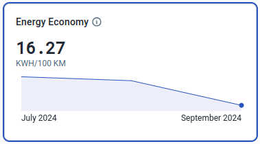
Trends
Energy Economy Tab
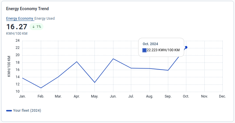
The Energy Economy tab shows your fleet’s average energy usage per unit of distance for the current year of the selected date range. The usage measurement is based on the units selected in user settings.
The graph displays the average energy use over the selected period above the chart, along with the percentage change in average usage compared to the previous period. Hover your mouse over the month within the line chart to view the average energy usage for that month.
Energy Used Tab
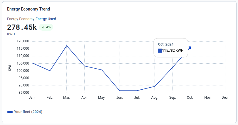
The Energy Used tab shows your fleet’s total energy used, in kilowatt hours, for the current year of the selected date range.
The graph displays the total amount of energy used for the selected period above the line chart, and the percentage change in total energy usage compared to the previous period. Hover your mouse over the month within the line chart to view the total energy used for that month.
Opportunities for reduction
The Idling Exceptions bar chart is the same as the chart displayed under Emissions Intensity; however, the chart only displays exceptions related to battery electric vehicles.
Avoided Tailpipe Emissions
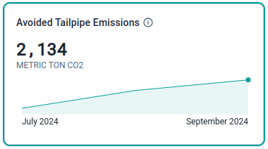
The Avoided Tailpipe Emissions metric, available under the All (if your fleet includes plug-in hybrid or battery electric vehicles), Battery Electric Vehicle and Plug-in Hybrid Electric Vehicle powertrains, displays the amount of CO2 emissions your fleet has avoided by using either plug-in hybrid or battery electric vehicles.
When this metric is selected, the trend graph displays one tab: Avoided Tailpipe Emissions.
Trends
Avoided Tailpipe Emissions Tab
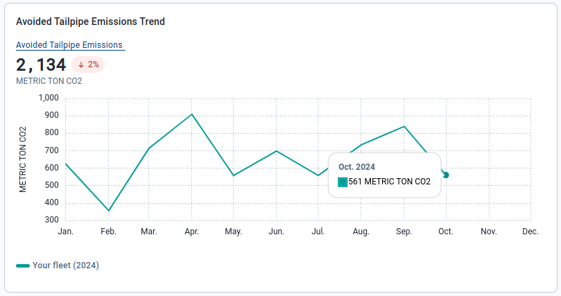
The Avoided Tailpipe Emissions tab shows the total amount of CO2 emissions your fleet has avoided over the current year of the selected date range. These emissions are measured in metric tons of CO2.
The graph displays the total avoided emissions above the line chart, along with the percentage change in total avoided emissions compared to the previous period. Hover your mouse over the month within the line chart to view the total avoided emissions for that month.
Electrification
The Electrification section assesses and reports the number of vehicles to potentially replace with either plug-in hybrid or battery electric vehicles.
The percentage of your light-duty fleet that can be electrified is highlighted in bold. This is calculated by dividing the number of vehicles that can be replaced by the total number of vehicles in your fleet. The potential emission savings over the selected date range is displayed to the right of the potential replacements.
Sustainability Center only calculates potential replacements for light-duty vehicles, vehicles under 10,000 pounds, and is primarily a rough calculation.
For a more in-depth calculation on what portion of your fleet can be electrified and the financial implications, click on the Run EV Suitability Assessment button or visit EV Suitability Assessment marketplace plug-in to install the Add-In in the Fleet Management Application. Visit the Electric Vehicle Suitability Assessment Add-In User Guide to learn how this add-in works.

Frequently Asked Questions (FAQs)
Data Availability
Why are there missing or no recommended replacements in the electrification section?
Only vehicles considered “light-duty” are included in the analysis for potential replacement.
Why is there an empty data message appearing for the selected groups and/or date range?
This typically occurs when the required data has not been processed and added to the MyGeotab database. Please try again with another date range.
Why is there inaccurate or missing data when a specific powertrain group is selected?
This may occur when devices are not assigned to the correct powertrain group. Only the following built-in groups are used by the Sustainability Center when determining device powertrain type:
- Battery Electric Vehicle
- Internal Combustion Engine
- Plug-in Hybrid Electric Vehicle
Devices are assigned to different powertrain groups automatically, but it’s possible for a device to be assigned to an incorrect powertrain group or not assigned to any group.
How can I verify which vehicles are in a powertrain group?
The powertrain groups listed on the page are built-in groups that can be selected on any page using the Groups filter.
You can navigate to the Assets page, and select any of the powertrain groups within the Groups filter to view the vehicles within each group.
Why does the displayed data differ from the Fuel & EV Energy Usage page and/or report?
The Sustainability Center uses the same data as the Fuel & EV Energy Usage page and report. However, the Sustainability Center requires additional processing that can cause more recent data not appearing immediately.
Data for the current month is available to view at the beginning of the subsequent month.
Can I view data for time periods that are not within the date picker options (for example, one month)?
The ability to choose a custom date range is planned for the future.
Can I export the data displayed on the page?
There are currently no options to export data.


